Here Are Some Of The Oldest Logos That Still Exist – But Some Have Changed
The first-ever written ad was found in the ruins of Thebes in Egypt. It was a Papyrus created in 3000 BC by a slaveholder trying to find a runaway slave while also promoting their weaving shop. It didn’t take long to catch on, and before long, logos started appearing, identifying products and producers. The companies illustrated below have stood the test of time.
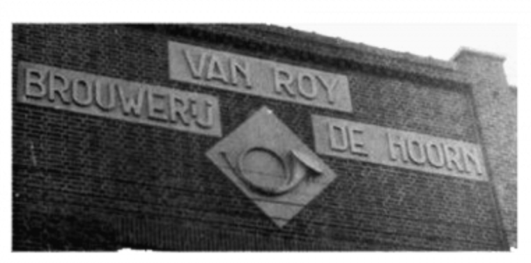
The Stella Artois logo was first used in 1366, when the Den Hoorn brewery was established. From 1366 to 1717, the logo featured the “Deen Hoorn,” marking the beer’s long history and connection to its original brewery.
British tea company Twinings has the oldest logo, which has been continuously used with no alterations to its design. It was created for the tea company more than two centuries ago, in 1787. The company logo is based on the Twining family crest and also references China, from which the company exclusively sourced its tea.
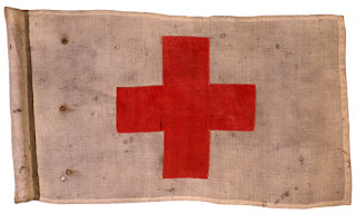

The Red Cross. On August 22, 1864, a conference was held with several nations, military medical services, and humanitarian societies in attendance. On this date, an international treaty known as the Geneva Convention was signed. The treaty granted neutrality and protection to medical personnel and facilities bearing an identifiable emblem – the symbol of a red cross on a white background. The symbol needed to be simple, recognizable from a distance, and universal. The committee chose a design that was the reverse of the Swiss flag because of the country’s constant neutral standing and because variations in color and shape would not change the status of the cross.
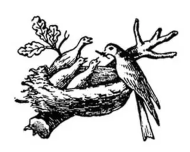
Nestle’s logo was first used in 1868. Henri Nestlé’s original Nestlé trademark was based on his family’s coat of arms, which featured a single bird on a nest. In time, Nestlé added three young birds being fed by a mother, to help create a link between his name and the products he’d created.

The Heinz logo design journey began in 1869, when simplicity and functionality were at the forefront of graphic design. Nestled in the heart of that era, the original Heinz logo design managed to capture an essence of modernity and timelessness that would endure for nearly a century. Designed with a bold red inscription set against a crisp white background, the original Heinz logo was an emblem that conveyed strength, purity, and quality. The logo’s capitalized letters were executed in a custom rounded sans-serif typeface, creating a pleasant and distinctive visual harmony. The characters were extended and solid, offering a robust and reassuring presence on the product labels.
Original Logo
Today
Amstel Bier’s logo was first used in 1870. Amstel® was born from the friendship of two friends who wanted to share a better bier. The iconic red and white circle within the Amstel® roundel represents billiard balls. The Amstel® founders loved to play billiards together, and the logo still represents their commitment and friendship today.
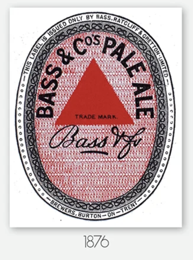
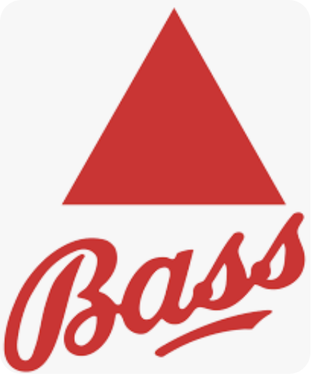
Bass Ale’s logo (top) was first used in 1876. The brewery’s red triangle logo became the first registered trademark in the UK in 1876. That triangle is clearly visible on beer bottles, as depicted in Edouard Manet’s 1882 painting “A bar at the Folies-Bergère” and in dozens of paintings by Picasso. Below that is the current logo.
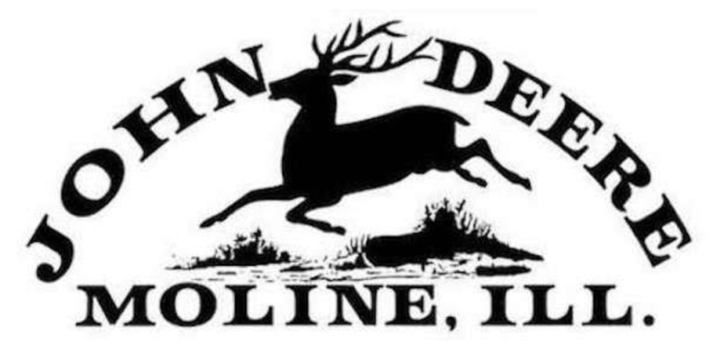
Though John Deere fashioned his first polished-steel plow in Grand Detour, Illinois in 1837, the evolution of his company took years and remained a small operation for quite some time. By the time he had employed 16 people, the operation was still without a name and a logo. The iconic logo was created and first used in 1876.
(Image credit: BMW)
BMW began life as Otto Flugmaschinenfabrik, founded in 1910 by Gustav Otto in Bavaria as a manufacturer of aircraft engines. The firm was reorganized in 1916 into Bayerische Flugzeugwerke AG, then renamed Bayerische Motoren Werke (BMW) in 1922. The company’s first logo was created in 1917 and remains a stone-cold design classic.
(Image credit: Everlast)
Everlast is an American brand of sports equipment that has become synonymous with boxing. But it began life in 1910 when 17-year-old Jacob Golomb, the son of a tailor and an avid swimmer, designed a type of swimsuit that would last longer than one year, hence the name ‘Everlast’.
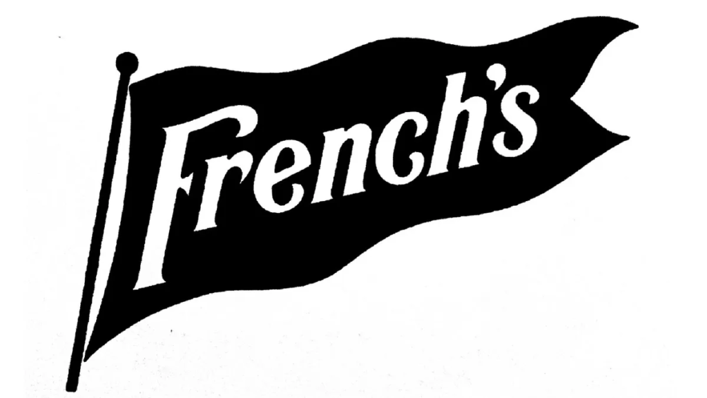
(Image credit: French’s)
French’s is an American brand of prepared mustard, condiments, fried onions, and other food items. It was created by brothers Robert and George French after they bought a flour mill in 1883 in Fairport, New York. Today, it’s the number one mustard brand in the US; according to Statista, 146.94 million Americans used French’s in 2023. Originally made for salad dressing, French’s mustard quickly became a staple condiment for America’s favourite pastime: baseball. Their association with baseball food – especially hot dogs – was so strong that in 1915, the company adopted a pennant much like the ones seen on stadiums as its official logo.
(Image credit: New York Yankees)
Established in 1903, the New York Yankees are an American professional baseball team whose cultural impact can’t be understated. Even non-Americans with no interest in sports will be familiar with the team from countless references in popular culture, from movies and TV shows to music lyrics. Not to mention that their emblem, which first appeared on team members’ jerseys in 1913, has become a global fashion staple.
(Image credit: Warner Bros)
Founded in 1923 by four brothers, Harry, Albert, Sam, and Jack Warner, Warner Bros. established itself as a leader in the American film industry after the success of one of the first sound pictures, the Jazz Singer in 1927. They grew to become a global conglomerate, diversifying into animation, television, and video games, and their current net worth is estimated at $26.19B.
(Image credit: Ford)
The Ford Motor Company, founded by Henry Ford in 1903, revolutionized not only car making but also mass production itself. Today, it remains the second-largest US-based automaker (behind General Motors) and the sixth-largest globally. Ford had several logo designs in 1903, 1907, 1909, 1912, and 1917. But then, in 1927, the logo underwent a significant change. The script logotype was placed in the now synonymous blue and white oval that remains iconic today.
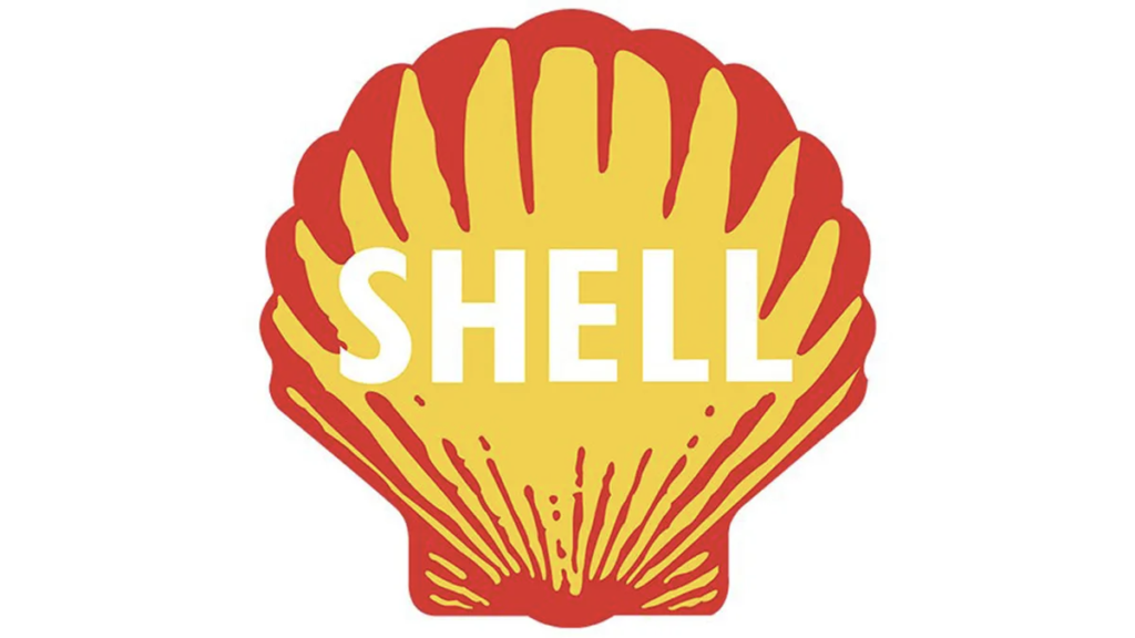

(Image credit: Shell)
Since first appearing in 1901, the Shell logo has moved from a realistic rendering of a scallop shell to a more simplified shape. Yellow and red have been a fairly consistent element, although no one is quite sure why. These colors may come from the company’s export origins, as both yellow and red are used in maritime signalling. Others have pointed to the logo’s early introduction at Californian service stations and the fact that red and yellow are the colors of Spain, where many early Californian settlers were born. Either way, the Shell logo remains an icon of branding history.
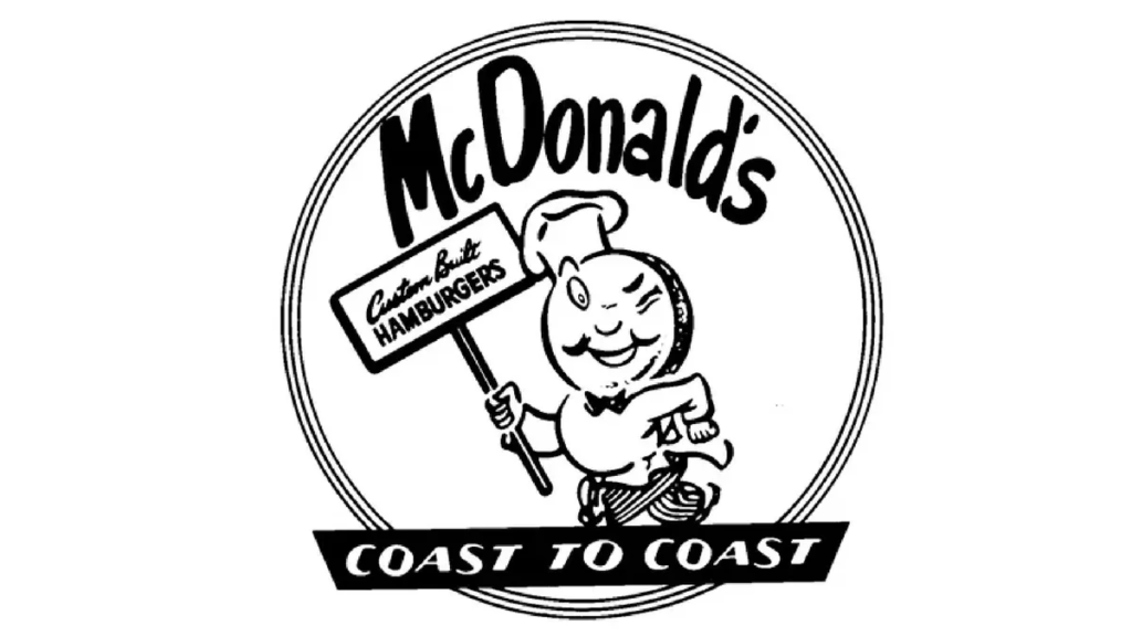

(Image Credit: McDonald’s)
The best logos of the 1940s stand the test of time, and McDonald’s logo is a prime example. Today, McDonald’s golden arches logo is one of the most recognizable in the world.
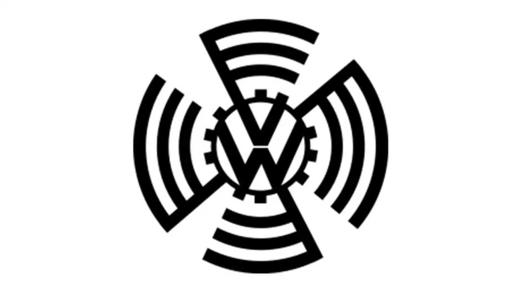
VW logo during the 1930s, initials V and W surrounded by a stylized cogwheel and swastika wings
1937 – 1939 Adolf Hitler was involved in the creation of the first Volkswagen logo! He envisioned the launch of a “people’s car” for the citizens of Germany. The “V” (Volks) and “W” (Wagen) were depicted inside a cogwheel circle. 1939 – 1945 The initial logo’s design changed during World War II. The cogwheel remained, but thankfully the references to the Nazi swastika disappeared. The military mainly used the logo on their military vehicles. 1945 – 1960 The post-war logo remained Volkswagen’s emblem for 15 years.
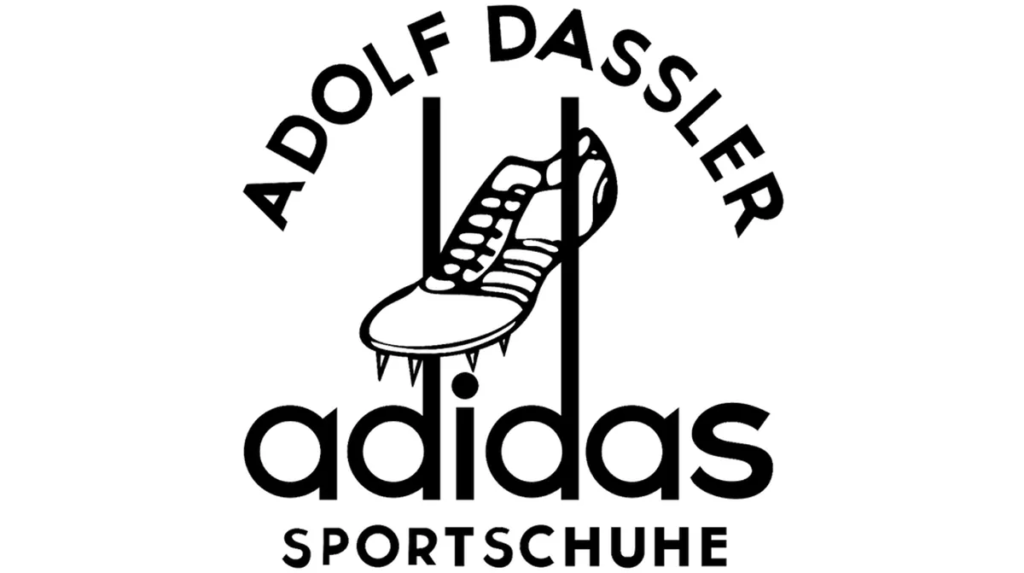

(Image credit: Adidas)
Today, Adidas is the largest sportswear manufacturer in Europe, and the second largest in the world, after Nike. Its founder, Adolf ‘Adi’ Dassler, first began making shoes in 1924, but it wasn’t until 1949 that he registered the name of his company and created a logo to represent it.
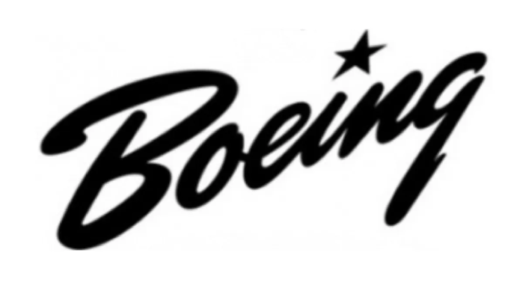

(Image credit: Boeing)
“The Boeing logo from the 1940s has a very different feel to what you’d expect given the circumstances,” says David Nathan Davies, design director at Design by Structure. “Set in a script typeface on an upwards diagonal slant, the logo has a great sense of movement and a more positive and uplifting tone. This is further reinforced by the title being replaced by a star; no doubt a reference to the Stars and Stripes.”
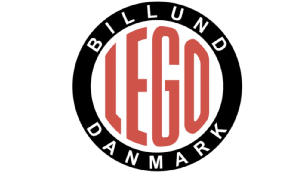
(Image credit: Lego)
For half a century, Lego has been known for making plastic toy bricks, which encourage both kids and adults to express themselves and be creative in three dimensions.
Founded in 1932, the Danish company originally made wooden blocks. But after the Second World War, that all changed.
(Image credit: NASA)
We tend to associate NASA, the National Aeronautics and Space Administration, with the 1960s when it achieved its historic goal of landing the first man on the moon. But the agency was first established by President Eisenhower in 1958, sporting a logo that would become truly iconic. The original logo remains in use today, along with a newer, more stylized version consisting of only letters.
(Image credit: The Coca-Cola Company)
The Coca-Cola logo doesn’t need much introduction. The Coca-Cola Company and its flagship fizzy beverage possess one of the best-known brand identities in the world, with its red and white colors and script font covering signage and shop shelves almost everywhere.
What’s especially remarkable about the Coca-Cola logo is its staying power. Over its 130-year history, the logo hasn’t changed much at all. It was originally very much a logo of its time.
The Coca-Cola logo and brand are the most recognizable in the world. The red and white Coca-Cola logo is recognized by 94% of the world’s population.

Welcome to 3-Minutes A Day University, where you can learn a little about a lot of things every day in three minutes or less. We help you expand your knowledge and understanding of the real world, and 3-MAD University is tuition-free. Our wide-ranging syllabus includes a fascinating insight into topics including Health and Medicine, Science, Sports, Geography, History, Culinary Arts, Finance and the Economy, Music and Entertainment, and dozens more. You will impress yourself, your friends, and your family with how easy it is to learn facts and perspectives about the world around you. One topic you will never find covered is politics. We hope you enjoyed the previous three minutes. If you liked this post, please pass it along to a friend.
Was this email forwarded to you? Subscribe Here.
© Copyright 2024. 3-Minutes A Day University All Rights Reserved. Unsubscribe
